Run4It
Run4It is a virtual road race game to help children and young adults learn about exercise and healthy eating habits. This was a group project from the Spring of 2012 in the Human-Computer Interaction class, with programming support by Georgia Tech Research Institute. My group designed the interface and interactions.
This game uses the Microsoft Kinect to detect that a player is jogging in place. The player progresses through the level at whatever speed they are jogging. Each level is built from a real-life route comprised of images from Google Street View. Throughout the course there are water bottles and sodas, as well as healthy and unhealthy snacks. These teach the player the benefit of staying hydrated and making healthy decisions.
Throughout the course of this project my group researched existing systems, conducted a survey about exercise and video games, defined user characteristics, generated personas, performed task analyses, and created critical use cases and usability goals. From this information we created sketches, mockups, and an interactive prototype, which we used to perform user testing.
Group:
Shane Owens
Jonathan Schuett
Kevin Terraciano
Xiao Xiong

Interface Options Sketch
Sketch by Xiao Xiong
This shows the many design options we considered early in the process of designing the game's interface. The sketches were done by Xiao while all group members sat around the table making suggestions. We divided up the options for displaying hydration, power ups, distance traveled, progress through the course, and audible notifications to use for our individual mockup concepts.

Gesture Options Sketch
Sketch by Xiao Xiong
We considered a few different gestures for interacting with menu screens using the Kinect. On a route-selection menu with a globe, the user can swipe their hand sideways to spin the globe. Zooming could be done with a "pinch-to-zoom" gesture that is performed with the arms rather than the fingers. Users tended to like the playfulness of this interaction but it was a bit too complex for finding specific courses.

Filter Menu Sketch
Sketch by Xiao Xiong
This is an early sketch of what would become my filter selection interface for the route selection screen.
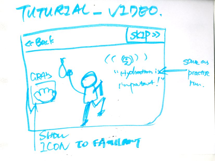
Video Tutorial Sketch
Sketch by Xiao Xiong
Three types of tutorials were considered: a practice round (where the user learns to run before the first race), trial-by-fire (where instructions are only given at the start of the user's first race), and a non-interactive video tutorial. I mocked up the video tutorial.

Menu Mockup
There are two main components of this route selection screen. First, the user selects a filter by swiping up and down on the left side of the screen, which adjust which routes are shown. The routes themselves are shown in a cover flow-style display. Swiping left or right on the rest of the page flips through the available options found within the selected filter.
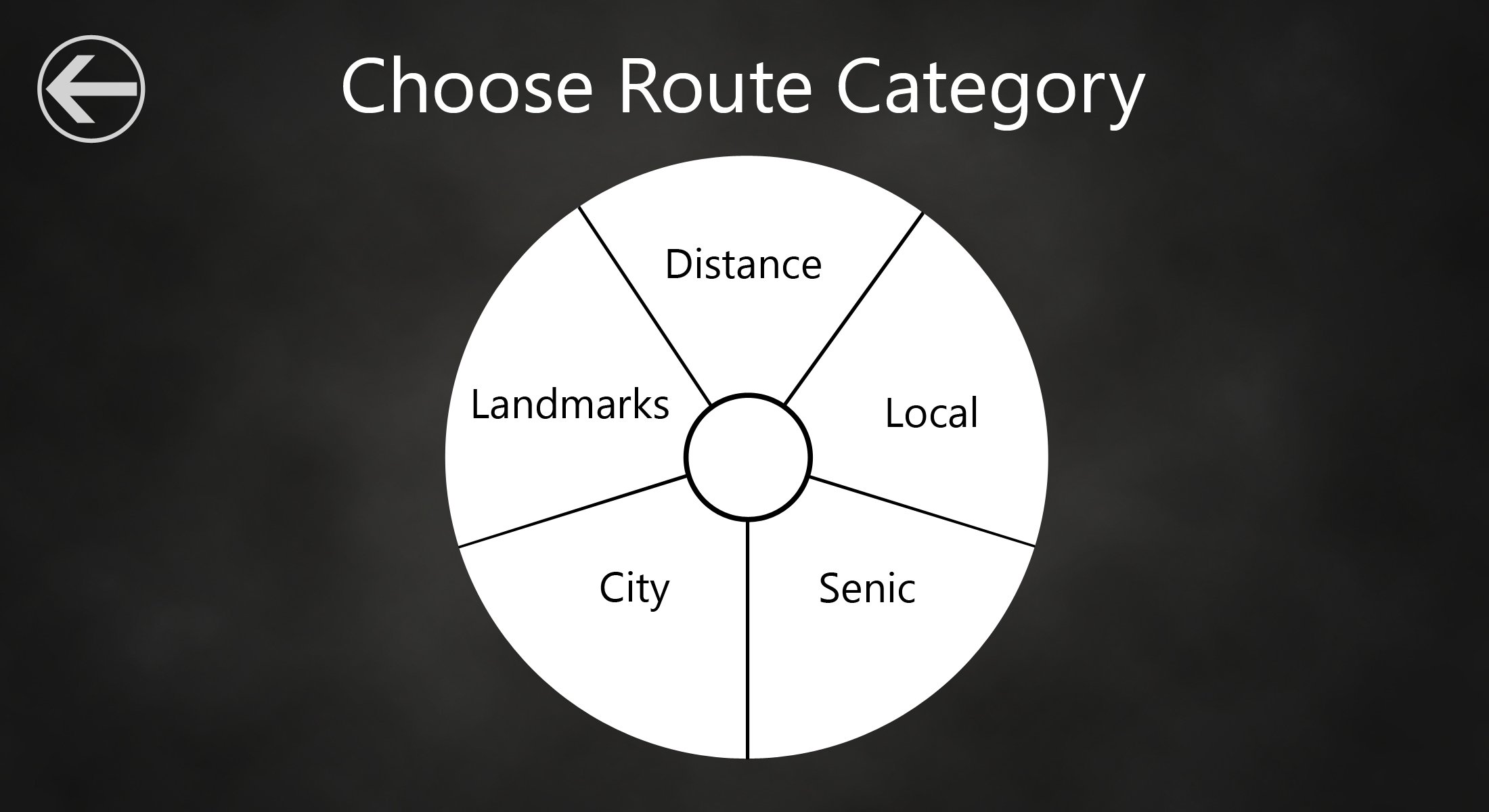
Pie Menu
A pie menu is an alternative method of choosing a filter. We felt that a pie menu was an interesting type of menu for gesture control since, starting from the center, each option is an equal, short distance away.
Video Tutorial
The video tutorial focuses mainly on the gameplay and interface rather than interactions or environment. A voice narrates the tutorial explaining what the user should be doing to complete a run. It is shown the first time the user plays, and can be skipped if the user has somehow already seen it.

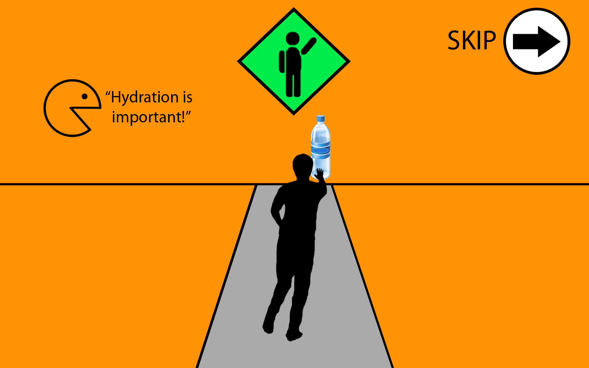
Gameplay Mockup
In my mockup of the gameplay, the user has an avatar that is seen in a third person view. (In the other mockups there is a first-person point-of-view.) The hydration meter is double coded: the word "hydration" is shown as well as a picture of a drop of water. There is also the percentage number along with the drop visually filling with water. "Street sign" instructions are shown at the top of the screen showing which gesture to perform. In this picture the user is being told to reach out to the right for the water bottle.

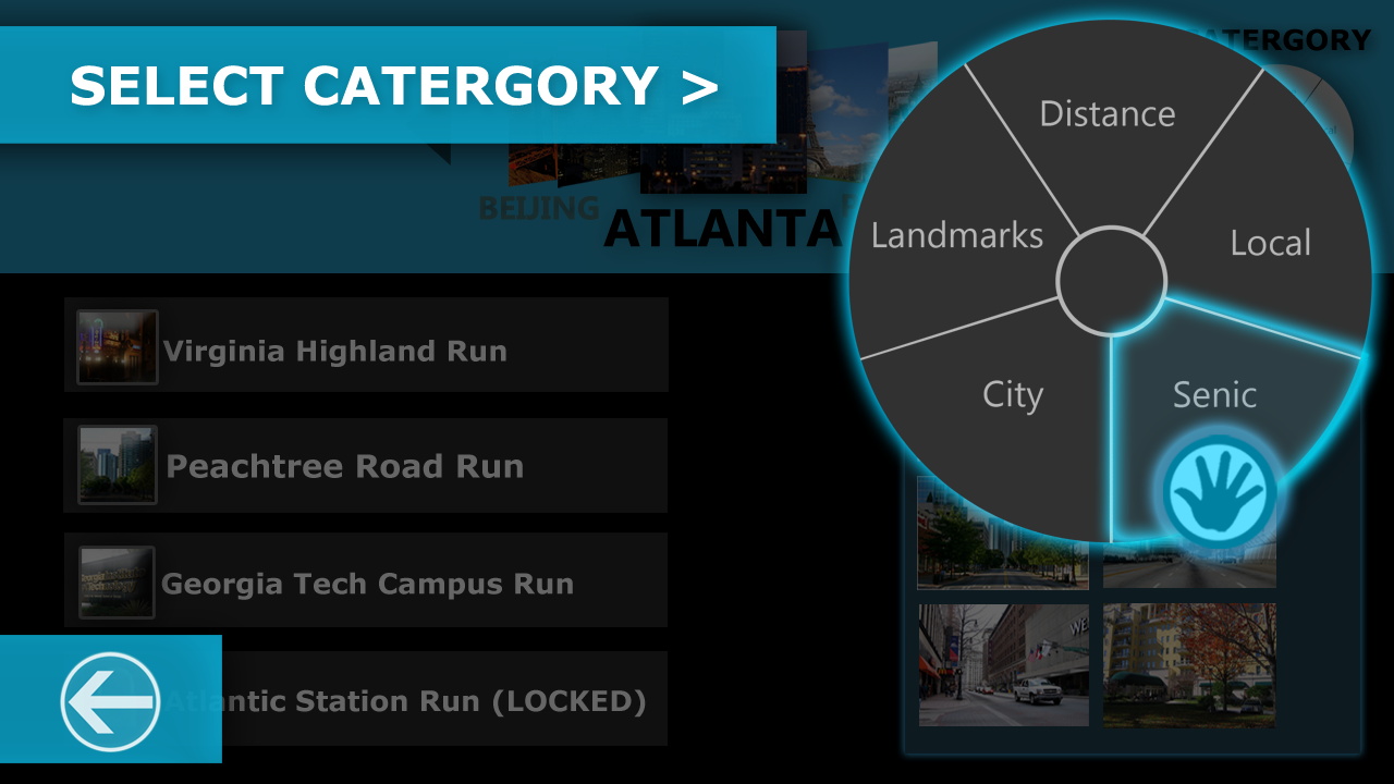
Final Menu Screen 1
Final menu by Xiao Xiong
This is the final, interactive version of our route selection screen. It is heavily based on my mockup with some additional features. Since users liked the cover flow and pie menu options, and since they are interesting to interact with using hand gestures, we kept those elements.
Once the player narrows down their choices by choosing a category and, in this case, city, they may hover their cursor over the "RUN" button next to the course to begin.
Final Menu Screen 2
Final Menu by Xiao Xiong
Once the player reaches to hover their cursor over the pie menu icon (it's good to stretch before exercising, right?) the menu expands, allowing them to choose a category of courses. Hovering over one slice of the pie (or wedge of the apple if we're trying to be health-conscious) will select that category.

Final Gameplay
Final Gameplay Design by GTRI
This is what the player sees on the screen while running in place. By using successive images from Google Street View, it appears as if the player is running through a real-life environment of their choosing. Healthy and unhealthy snacks and drinks are scattered on either side, allowing for the runner to reach out in either direction to grab them. The icons that received the best feedback in user testing were chosen for the in-game interface.

User Testing the Prototype
After the interactive prototype was complete we brought in users to try it out and think aloud while using it. After selecting a specified course and running it we gave them a short interview (with a bottle of water) to find out what they liked and what could be improved. This feedback went in our final report.